ProDesign — Custom GetCourse Learning Experience
Three learning products in one student cabinet.
Related services:Online school developmentGetCourse design and developmentWebsite redesign
- Client
- ProDesign, a web-design school
- Industry
- Online education
- Scope
- Student cabinet design system
- Platform
- GetCourse
- Role
- Design + builder implementation
Project scope:3 learning products in one system11 cabinet screens in this case study2 layouts per screen: desktop and mobile
What was broken
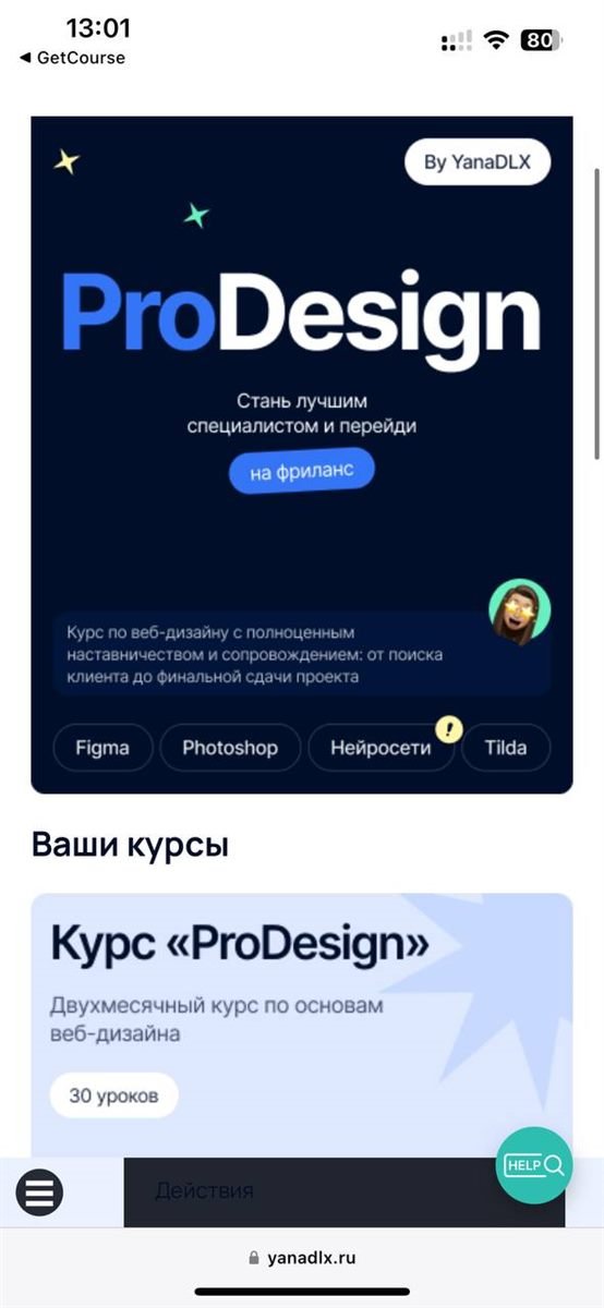
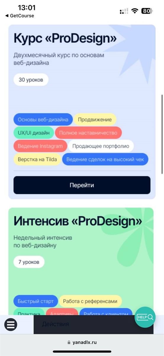
Three different products lived inside one technical platform: a two-month core course, a one-week intensive and a free introductory track. The default GetCourse interface made them indistinguishable — from each other and from thousands of other schools — and a student couldn't always tell where they were and what to do next.
Constraints
- A student always knows where they are and what's next
- Three products stay distinct but share one brand
- The mobile version is built separately
- Everything within the platform's builder — nothing to break on update
The new learning interface
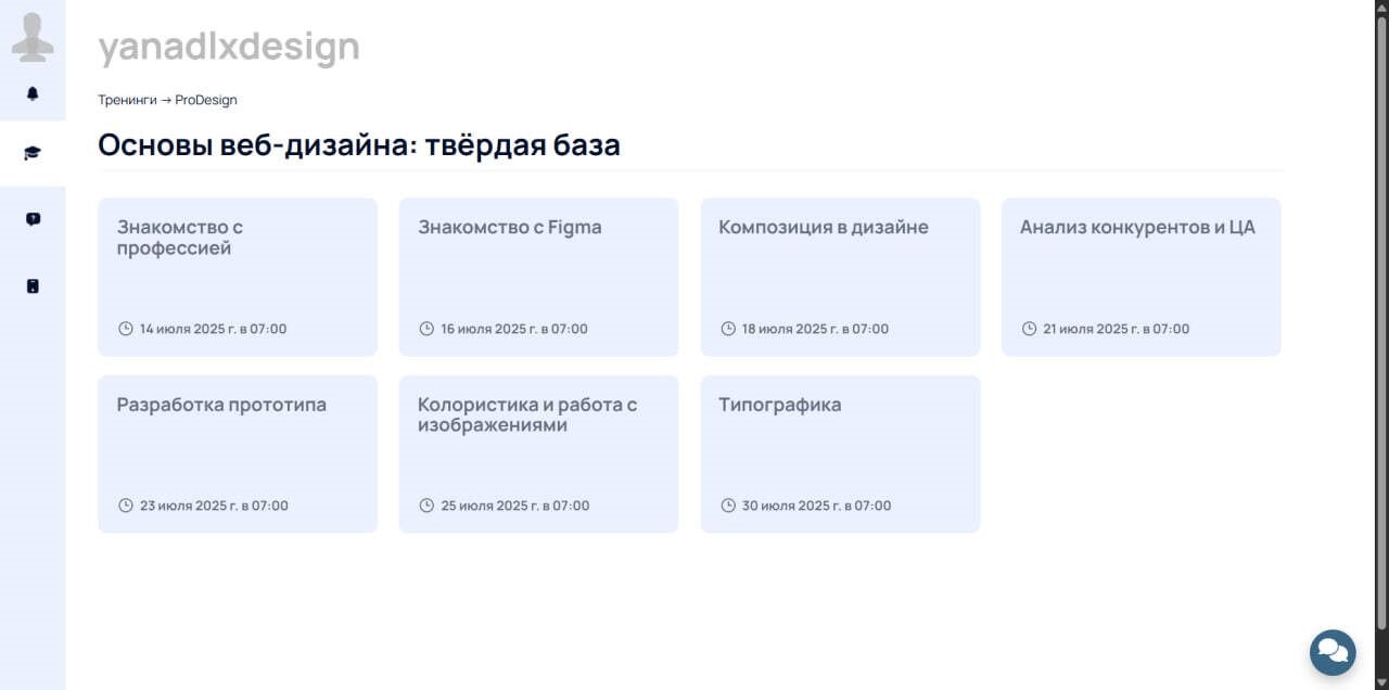
Three products looked identical.
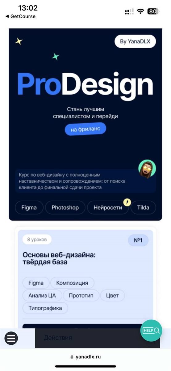
One visual system with per-product variations: each track is recognisable at a glance but clearly belongs to the school.
Students got lost in a flat list of lessons.
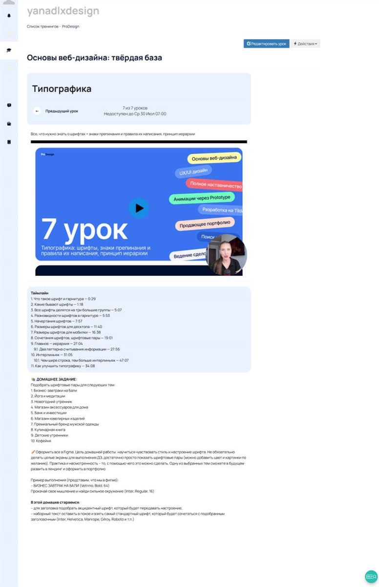
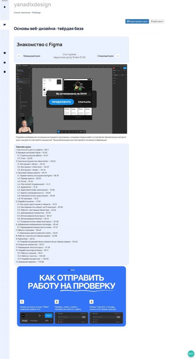
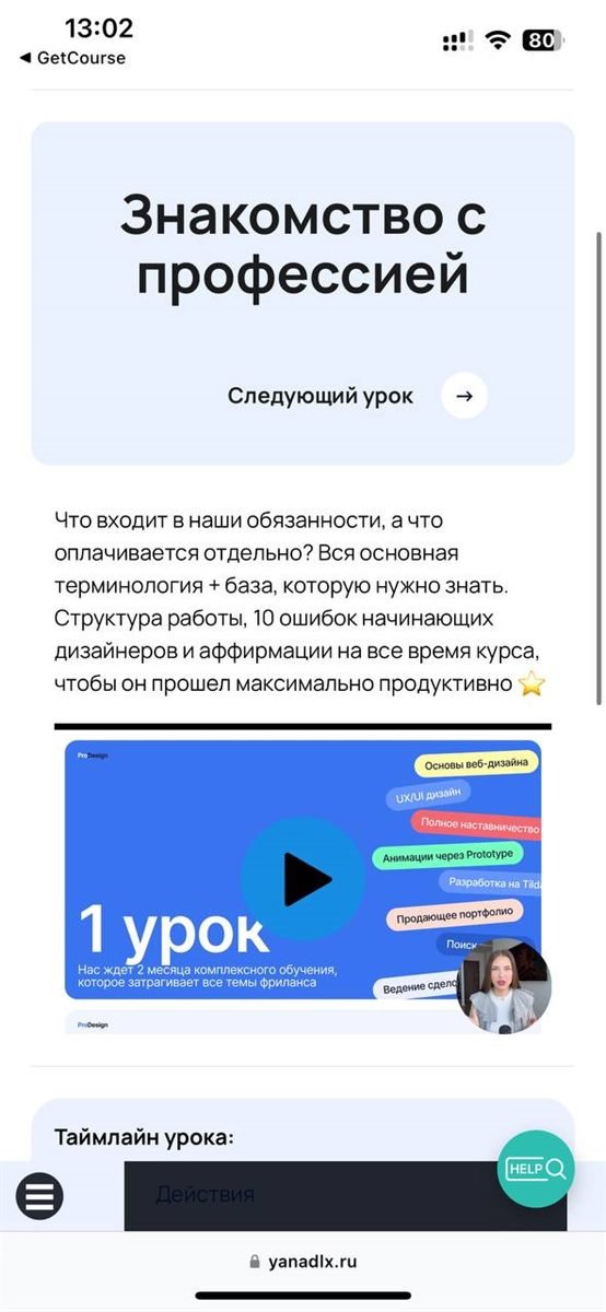
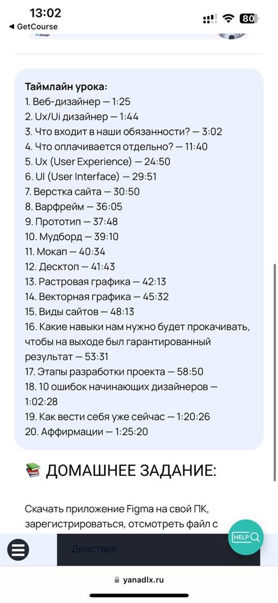
Navigation is built around a timeline and lesson states — done, current, ahead, homework — so the next action is always visible.
The builder's default mobile view broke the layout.
The mobile version is assembled separately, down to every lesson screen.
Key decisions
Timeline instead of a list
Progress is the navigation.
Lesson states
Done, current and locked look different at a glance.
Separate mobile build
Instead of shrinking the desktop UI.
Design within the platform
No external hacks that break when GetCourse updates.
Before → after
- Stock platform interface
- Three indistinguishable products
- A flat lesson list without progress
- A branded student cabinet
- Recognisable tracks in one brand
- A timeline with progress and a clear next step
Project screens

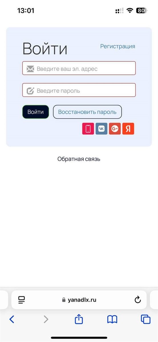
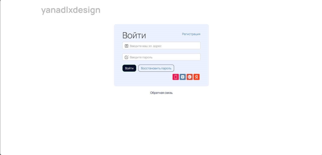
By the numbers
Estimates are labeled and derived from the change in the user flow, not from client analytics.
After
GetCourse no longer looks like someone else's platform: a student opens a dashboard in the school's own style, sees on the timeline where they are and what's next, and gets a separate mobile version on the phone.
The client doesn't share conversion analytics, so the outcome is described in words, without numbers.
Working on something similar?
Tell me about the project and I'll suggest a practical way to build it, a platform and a timeline.
Get a scope & estimateRelated projects
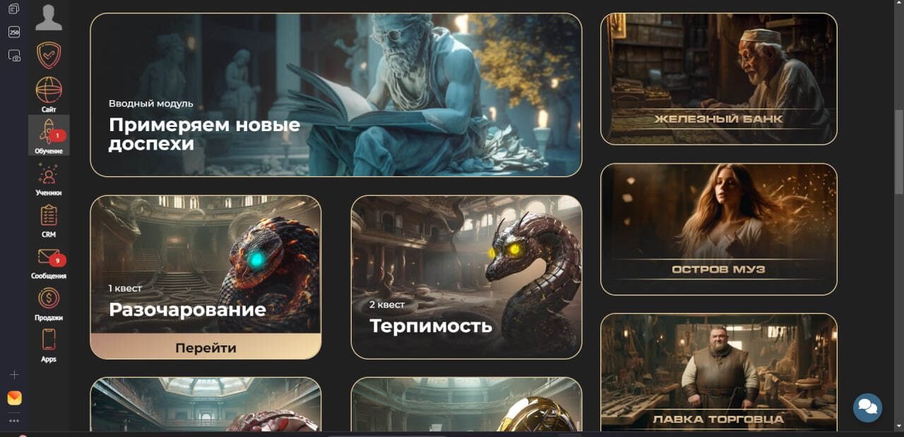
Path to Greatness — Mentorship School
A personal-development platform that lays its programmes out as a path. Each module is a step along that path, and the member area holds the lessons, the materials and the places to ask for help.
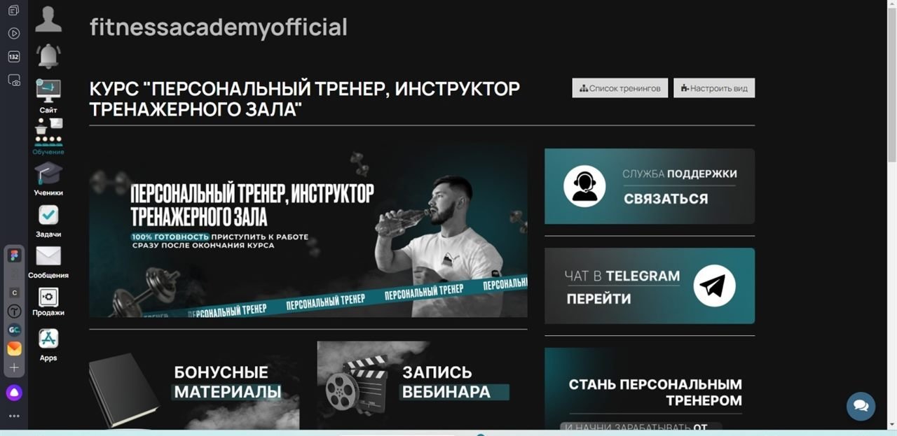
Fitness Academy — Personal Trainer Course
An online course for personal trainers: anatomy, biomechanics, nutrition, working with clients and how to market themselves. The member area gathers the study modules, extra materials, webinars and the final assessment.